
As a good developer, you want to write code that is easy to reuse. Even better, you do not want to write the same piece of code twice. In fact, when it comes to programming you create functions so that you can quickly execute their logic by calling them. With Vue.js, we have a similar concept with components: Vue Slots. In this tutorial, we will see how to use Vue slots and why they are important.
You can guess it by the title, in this tutorial we will talk about Vue slots and only about those. To get everything out of this tutorial, you should know JavaScript already and be familiar with Vue.js. If you aren’t, the best place for you to start is How to start with Vue.js.
What are Vue Slots?
The best way to explain slots is with an example. Imagine you have a dialog box, something that will pop-up on top of the screen, above any other layout component. You normally use those to show error messages or to ask for confirmations.
You may want to use this dialog multiple times in your application, every time with different content. However, in every place you use it, it always has the same style, position, and logic. For example, in all cases, if you click outside the dialog you will close it, and so on.
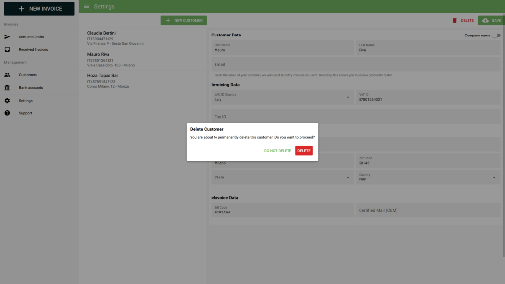
As you can see, our dialog has a title “Delete Customer”, a description that explains what is about to happen, and two buttons: Delete and Do not delete. In a different dialog, we may have other content, different buttons that do different things, but the main concept is still the same. In fact, in any dialog, we will have a window appearing on top of the screen, in this case also darkening the rest of the application.
So, it would be awesome if we were able to create a dialog only by specifying its title, content, and buttons. Wait, with slots we can do exactly that.
In fact, Vue slots allow you to have some placeholder inside the HTML of your components. Then, when you use that component, you can inject an HTML that is different every time. In other words, you are defining part of the HTML of a component dynamically, from outside that component.
How To Use Vue Slots
When we want to use Vue.js slots, we have two parts we need to take care of. First, we need to define a component that accepts slots. Then, we need to use that component and inject some content into the slots. This may sound somewhat tricky, but it is one of the easiest things of Vue.js. After we see that, we can dive into more advanced implementations.
Defining the Component & Using Slots
The first thing we have to do is defining a component that will accept slots. To do that, we can write a simple component, and add the <slot> tag inside its template.
The most basic example they give you in the official documentation is a custom link. Imagine you have a NavigationLink.vue component, you could fill its template like so:
<a
  v-bind:href="url"
  class="nav-link"
>
  <slot></slot>
</a>
This means we are creating an <a> link, but with no text in it by default. Instead, we expect the text to be provided as a slot. As such, whenever we call this component, we can do like so:
<navigation-link url="/profile">Your Profile</navigation-link>Yes, we are simply providing some text inside the navigation link. This will be considered the slot, and be placed in that position. Of course, this is normal HTML: we can use also other HTML tags and even other components, not just plain text.
Now, if we call the navigation link without providing a slot, we will have no text inside it. However, you may want to have some fallback default content. Easy enough, just put it within the <slot></slot> tags.
<a
  v-bind:href="url"
  class="nav-link"
>
  <slot>Fallback content</slot>
</a>
This simplicity shows you how powerful Vue.js slots are. Yet, there are many other possibilities and flavors of slots that we need to explore.
Named Slots
The example above is great if you want to just place some content inside your component. However, you can do that just once: you have a single piece of content to place inside the component.
We can already see the limitation of that. In fact, thinking back about our dialog example, we do not want to provide one piece of content, but three. Our dialog will need to contain the dialog, the content, and the buttons. One slot is simply not enough, but how do we distinguish what goes where?
Easy enough, when we define a component we can simply provide a name to the slots. For example:
<div class="my-dialog">
  <h1><slot name="title"></slot></h1>
  <div class="content">
    <slot name="content"></slot>
  </div>
  <div class="buttons">
    <slot name="buttons"></slot>
  </div>
</div>
Now, when it comes to instantiating our dialog component, we can simply use a template with the v-slot property, specifying the name of the slot. Everything that we will put inside the template will land in the proper slot.
<my-dialog-component>
  <template v-slot:title>Dialog title</template>

  <template v-slot:content>
    This is the content of the dialog, it can contain <i>some</i> HTML <b>code</b>.
  </template>

  <template v-slot:buttons>
    <button>OK</button>
  </template>
</my-dialog-component>
Easy enough, we are now passing the different slots into the same component. Thanks to their name, the component will know how to deal with them and will place them in the proper spot.
To make things look even better, you can use the # shorthand instead of v-slot.
<my-dialog-component>
  <template #title>Dialog title</template>

  <template #content>
    This is the content of the dialog, it can contain <i>some</i> HTML <b>code</b>.
  </template>

  <template #buttons>
    <button>OK</button>
  </template>
</my-dialog-component>
Scope of Variables
Sometimes, you want to access some variables of your component inside components. That’s something we do with the curly brackets notation, but also in v-model and v-for statements.
How all this interact with slots? It is very simple: you can access the variables of the file where you write the code. Also, in this case, an example will make things clearer. Imagine you have the Home.vue view, that includes the following code.
<my-custom-link to="/order">{{ text }}</my-custom-link>As you can see, we are accessing the text variable. Does this variable have to be defined in Home.vue, or in MyCustomLink.vue? Well, since we are writing this code in Home.vue, that’s where that variable must be defined.
In other words, when injecting a slot, the slot cannot access the properties of the component where it is injected into. Instead, it accesses the property of the component where it has been created.
Slot Props
The default behavior we just described when talking about the scope of variables is fine in most cases. However, there are some occurrences when we want to be more granular. We can do that with Slot Props.
Much like normal props, we need to define on the component that we are accepting them, and then when we instantiate it we can pass them along. As such, inside of your components with slot, you can use a special v-bind command.
<div>
  <slot name="userSlot" v-bind:user="user">
    {{ user.name }}
  </slot>
</div>
Then, when we instantiate this component, we can provide a value to that user as follows.
<my-component>
  <template v-slot:userSlot="slotProps">
    {{ slotProps.user.name}}
  </template>
</current-user>
With this statement, we are telling to place the user variable inside the slotProps variable. Then, we can access it from the parent. It’s a little tricky because we are defining in the parent how to render a variable that was originally defined in the child, but hopefully, you get the point.
Vue Slots for Full Stack Developers
We simply cannot stress this enough: practice, practice, practice. To learn things – and remember them – you have to practice them. Because of that, all our tutorials include an exercise you can try to help all those nice concepts sink-in into your mind.
In fact, this tutorial is part of a free Full Stack Development course, where we are building a web app for a pretend bakery store website. Today, we are going to include Vue slots into the exercise. You can find more information on GitHub.com at alessandromaggio/full-stack-course, or simply read on for the assignment.
Even if you are not following the course, you should try the exercise – it will help you remember all this!
The Assignment
For this assignment, we want to create a component, AppDialog.vue. This dialog should appear as an overlay on the page, making it darker and showing a message at the center of the screen. That message is to be provided with a slot, just a single one. It should look something like this:
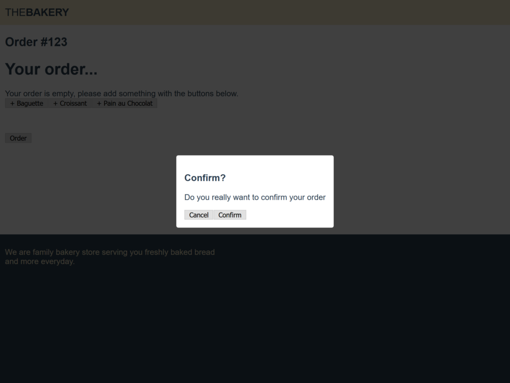
We should add this dialog inside our Order page, so we should call the component here. It is on that page that we should provide, as a slot, all the content of our button, from text to buttons.
Our dialog must be able to appear and disappear based on its value. As such, it will have a prop value that should be a boolean, transformed to false when the user clicks outside of the dialog.
Finally, we need to add an “Order” button on the page to show the dialog, and both the “Cancel” and “Confirm” buttons will simply hide the dialog.
At this point, you have everything you need to perform this exercise and try that by yourself before checking the hints – let alone the solution.
Some Hints
In this exercise, we do much more than just slots, and you may need some help in other areas. Particularly, placing the dialog in the way shown in the screenshot can be tricky.
To do that, you will need to use one div for the underlay, one div for the placement of the dialog, another for the vertical centering, and finally, the one actually containing your dialog.
Another challenging part is the appear-disappear mechanism of the dialog, particularly when clicking outside of it. If you placed your placement div correctly, you can listen to events on it. Yet, since it also contains your dialog, the dialog will disappear if you click on the dialog itself. To avoid that, you need to check the target.className property of your event.
With this extra help, you should be able to get to the solution. Even if you don’t, we have it right below, so don’t panic!
The Solution
If you reached this point, it probably means you finished your exercise, hopefully with success. We will explain everything in a second, so stay put.
In case you want to see all the code from this exercise, you should take a look at this commit on GitHub.com.
Order View
We can start by editing our Order view. Here we need to add a dialog property in the data of the page. When that’s true, the dialog will show.
import OrderForm from '../components/OrderForm.vue';
import AppDialog from '../components/AppDialog.vue';

export default {
  name: 'Order',
  data() {
    return {
      dialog: false,
    };
  },
  components: {
    OrderForm,
    AppDialog,
  },
}
Then, we can tweak the template to include the dialog and also to have a button that will open it (dialog = true). Note how we are simply providing the content of the dialog as a slot.
<template>
  <div>
    <h2>Order #{{ $route.params.id }}</h2>
    <order-form/>
    <button @click="dialog = true">Order</button>
    <app-dialog v-model="dialog">
      <h3>Confirm?</h3>
      <p>Do you really want to confirm your order</p>
      <button @click="dialog = false">Cancel</button>
      <button @click="dialog = false">Confirm</button>
    </app-dialog>
  </div>
</template>
App Dialog Component
Now, it’s time to dive into our AppDialog.vue component, where all the action is taking place. In there we need to have a prop for the value, that will keep track of the dialog showing or hiding. It is important to have this property so that we can use v-model.
Then, we also need to have an onClick method that will decide if it is time to hide the dialog. This will check the event target (i.e. the element being clicked), and if the class name is the one of the overlay – and not the dialog – it will proceed hiding. To hide the dialog, we simply emit false as an input.
export default {
  name: 'AppDialog',
  props: {
    value: {
      type: Boolean,
      default: true,
    }
  },
  methods: {
    onClick(event) {
      if (event.target.className === 'app-dialog__overlay') {
        this.$emit('input', false);
      }
    }
  }
}
The template is convoluted, but not that much. We have an underlay, that is the one adding the darkening on the page. Then we have an overlay, which is a transparent element taking place all over the pace, that we use for centering. Inside of it, we have a vertical center, to center our dialog, and finally our dialog with props.
Note how the root element appears only when the value is true, and how the overlay is listening with onClick.
<template>
  <div class="app-dialog" v-show="value">
    <div class="app-dialog__underlay"/>
    <div class="app-dialog__overlay" @click="onClick">
      <div class="app-dialog__vcenter">
        <div class="app-dialog__dialog">
          <slot/>
        </div>
      </div>
    </div>
  </div>
</template>
In case you also want our styling, you can check it out below.
.app-dialog__overlay,
.app-dialog__underlay {
  position: fixed;
  top: 0;
  left: 0;
  right: 0;
  bottom: 0;
  display: flex;
  justify-content: space-around;
}

.app-dialog__overlay {
  z-index: 101;
}

.app-dialog__underlay {
  background-color: #000;
  opacity: 0.75;
  z-index: 100;
}

.app-dialog__vcenter {
  display: flex;
  flex-direction: column;
  justify-content: space-around;
}

.app-dialog__dialog {
  padding: 1rem;
  border-radius: 4px;
  background-color: white;
  display: inline-block;
}
And this is it! You now have a working dialog, not much different from one that could be used in real-world applications.
In Conclusion
With Vue props, we now have another extremely powerful tool that we can use to craft beautiful and scalable websites. Our frontend journey is almost complete, but we still cannot say we are the masters of JavaScript. There is so much more to do!
Stay tuned for the next tutorial that will transform you into a Full Stack Developer.