
When you create a page, you want different pieces of content to appear in different places. The header will go at the top, the footer at the bottom, and the content in the center. However, you can dive way deeper than that. For example, you may have a box to review cookie settings that pops up on top of everything else, or you might have a tiny button to start a chat always at the bottom-right of the page. CSS Positioning is the part of CSS that helps you create all of that. In this CSS Tutorial, we will see how to use it.
With CSS, you apply style to HTML documents. As such, you should know already the basics of HTML and the basics of CSS to better enjoy this post.
CSS Position Property
With CSS positioning, we decide where to place any element of our page, also in relation to the others. The lynchpin component that allows us to do that is the position property in CSS. With that property, we have a few keywords to define where we want our elements to appear.
As we will see in a second, the position of an element can be: static (the default), relative, absolute, fixed, and sticky. To apply this property, you can use some code like the one below.
div {
  position: static;
}
Now, it is time to dive into the characteristics of each different position.
CSS Position Static
Since the static position is the default value, all elements will get it unless you specify otherwise. Therefore, you can also omit it (not specifying any position) to apply it to an element.
You pretty much have an idea about how elements are rendered by default (with position static).
The static position will render the elements in the order they appear inside the HTML code. One after the other.
We can clearly see how this can be quite a limitation to create complex layouts. Instead, we need something more. However, we needed to understand static before going to more advanced options. That’s because they rely on static somehow.
CSS Position Relative
When we set the position to relative, we actually mean “position this element relative to its static position“. In other words, we can give our element an offset from its original position.
The relative position will render an element relative to the position it would have if it was static.
Think of it this way. First, you identify where the element would appear if the position was static. Then, you move it (up, down, left, or right) from that position. To give these offsets, you can use the keywords top, bottom, left, and right. Those will accept any distance value (e.g. px, em, rem).
#my-element {
  position: relative;
  left: 50px;
  top: 50px;
}
However, even if the element appears shifted (or offset), it still occupies its static position in the document flow. To say this in a simpler manner, all other static elements in the page will “believe” this element is having a static position. As a consequence, they will place themselves right after that static position. Thus, we can quickly end up with overlapping elements (the relative item going on top of the other elements).

Frankly, you generally don’t use offsets with a relative position. Yet, if you don’t, what’s the point of having a relative position? It will look exactly the same as a static one. This is true, and it is indeed pointless by itself. However, you can combine relative elements to some others to achieve complex positionings. That’s where you will use CSS relative positioning most of the time.
CSS Position Absolute
Now things start to get interesting. With an absolute position, an element can be absolute (i.e. free) from the document flow and be placed virtually anywhere on the page. When you use an absolute position, you typically want to make your element stick somewhere or go on top of other elements.
The absolute position places an element independently from the document flow, and relative to its first positioned ancestor.
What is the first positioned ancestor? Simply enough, it is the first HTML element in the chain of parents (ancestors) that does not have a static position. Or, more precisely, that has a relative position. To better understand this, we can take a look at the following example.
<div class="outer">
  <div class="inner">
    <div id="el-1">#1</div>
    <div id="el-2">#2</div>
    <div id="el-3">#3</div>
    <div id="el-4">#4</div>
  </div>
</div>
By default, the four elements (el-1 to el-4) will render just one after the other. However, if we change el-4 to have an absolute position, it will start to ignore the other elements to decide its placement. Instead, it will look up the chain. First, it will look at its parent (div.inner) and ask “Is my parent relative?”. If it is, it will place itself relative to the position of that parent. If it isn’t, it will go ask the same question up one level (in this case div.outer). This process repeats itself until a relative parent is found, or we reached the <html>...</html> tag. In this latter case, the element places itself relative to the position of the browser window.
Absolute Positioning Example
An example will help you clarify. We can use the following CSS, making relative div.outer (and not div.inner).
.outer {
  position: relative;
  display: block;
  width: 400px;
  border: 2px solid blue;
}

// This rule is just to add some style
.inner {
  width: 100%;
  padding: 10px;
}

// This rule is jsut to add some style
.inner > * {
  padding: 10px;
  border: 2px solid green;

}

#el-4 {
  position: absolute;
  top: 0;
  right: 0;
  background-color: orange;
}

* {
  box-sizing: border-box;
}
Note the box-sizing property, it is important and we will cover it later. All this code will render in the page like below.
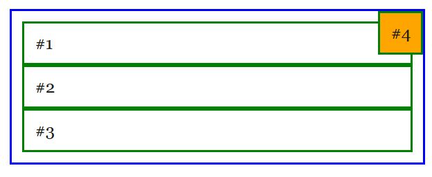
Another interesting remark is that, as the fourth element is breaking out of the document flow, its width is not 100% by default. And, since we didn’t set any width, it just gets the width it needs to render its content. Furthermore, we were able to place this element with an offset from the top-right, not from the top-left. That’s because we used the right property.
CSS Position Fixed
Once you understand absolute positioning, fixed positioning will be a walk in the park. In fact, they work exactly in the same way, but fixed is always relative to the browser window.
The fixed position will render an element relative to the browser window, regarldess of its location in the document flow.
In other words, it does not matter where you put inside your HTML your fixed element. It will just break out of the document flow, and position itself relative to the page. This means that any offset we give (with top, bottom, left, and right) will distantiate this element from the corners of the entire page.
div {
  positon: fixed;
  top: 0;
  left: 0;
}
This type of CSS positioning is extremely useful when you want to make headers or floating buttons. They just pop out and always stay in their place, even when you scroll the page.
CSS Position Sticky
With sticky positioning, we create a hybrid between relative and fixed. This approach is particularly useful for headers.
The sticky position will behave like absolute at the beginning, and will start to behave like fixed as the user scrolls.
To better understand this, think about the relative position. You place the element relative to one of its ancestors. However, once you place it, it stays there and the user may scroll it out of the window. Instead, the fixed position is the opposite. You ignore the ancestors and position the element relative to the entire page. And then, it sticks there while the rest of the page scrolls.
With sticky positioning, instead, you place it relative to its parent (like relative). However, this element then sticks there as the parent fades out of view (like fixed). You are getting the best of both!
div {
  position: sticky;
  bottom: 0;
}
Note that you must specify at least one threshold (top, bottom, left, right), otherwise, this property won’t work.
This is especially useful for a header. In fact, you want the header to be always on top, but you want to leave some room for the content. In other words, when the user is at the very beginning of the page, the header should not overlap with any content. You can achieve that with sticky.
Mastering CSS Positioning
Positioning elements with CSS isn’t just a trick you do with the position property. Indeed, you have some other properties you should play with. In particular, you should know about z-index and box-sizing.
CSS Z-Index
The property z-index is quite straightforward to understand. Whenever two (or more) elements overlap over one another, one will have to go on top of the other. How do we decide which one? You guessed it, with the z-index property.
This property consider your web page as made of many layers, one on top of the other. You just need to decide on which layer to render any given element. The higher the index, the more “above the rest” the element will be. In other words, if two elements overlap, the one with the highest z-index will appear on top.
div {
  position: sticky;
  z-index: 10;
}
Note that this property works only with positioned elements (relative, absolute, fixed, and sticky). It does not work with static elements.
CSS Box-Sizing
As the name tells you, box-sizing property is about the size of the box. Most specifically, it answers the question: “How should we calculate the size of this element?”.
Imagine you have an element that has a width of 100px. What do you want to include in these 100px? And, specifically, do you want to count the border and padding or not?
So, you can provide two possible values to this property. With content-box, which is the default, the width will consider only the content. As a result, any padding and border will be additional width and height. Instead, with border-box, you count content, padding, and border as part of width and height.
* {
  box-sizing: border-box;
}
My recommendation is to always use box-sizing: border-box, on all elements. In fact, you should apply it to the start selector (* { .. }) like we did in the code snippet above. In this way, you can ensure a more predictable behavior when it comes to sizing elements.
In fact, if you don’t use border-box, you will end up with an ugly situation. For example, if you set width: 100% to an item to make it as wide as the page and then add padding, the actual size of the element will grow and will make it go outside the page (to the right). You don’t want that, so always use border-box.
Become a Full Stack Developer
Now it is time to practice what you learned so far. Try to tweak all these properties and really make them yours. If you don’t have any project to try that on, you can try with our pretend Bakery Store website. It’s a wesbite we are bulding as part of this Full Stack Developer Course (that this CSS Tutorial is a part of).
So, if you are following that course (and you should!), today we will make sure that the header always sticks to the top. However, we also want to ensure that in doing so it does not overlap any content before the user starts scrolling.
On top of this requirement, we will also make the various menu options in the header appear one next to the other, unlike a normal list. To do that, we will have to tweak with the display property.
Plus, we will ensure we will have no surprise on how the size is calculated for any element on the page.
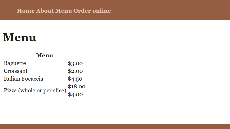
The final result will pretty much look something like the one below. The screenshot is taken from the menu page (menu.html).
As always, try to do the exercise on your own before looking for the solution. Once you feel confident, try looking at the solution below. In addition to that, you can always check the full code on GitHub. Below, the code we added here and there.
* {
  box-sizing: border-box;
}

header {
  margin: 0;
  padding: 0.6rem;
  display: block;
  width: 100%;
  height: 60px;
  background-color: #955E42;
  color: #E6CCBE;
  position: sticky;
  top: 0;
}

header ul li {
  display: inline-block;
}
Note that some of the code, particularly in the header selector, was already present. If you want to check and compare the code, you should take a look at this commit on GitHub.com. Additionally, here’s the link to the full repository: alessandromaggio/full-stack-course.
Wrapping It Up
CSS Positioning is an essential part of the style of any web page. In this CSS Tutorial, we saw how to use the position property to place elements exactly where we want them to be on our page. Then, we saw how to handle overlaps with z-index and how to ensure elements are dimensioned correctly with box-sizing.
Positioning is probably one of the most difficult parts of CSS, so the suggestion here is simple: practice, practice a lot!