
When we style or web pages, we want them to be perfect. We want them to work well on any kind of device, from smartphones to smart TVs. However, what works well on a smartphone may not be the wisest design choice for a large screen. Well, with CSS Media Queries, you can apply some CSS rules selectively, only in special conditions. In this CSS Tutorial, we will see what media queries are and how to use them.
As part of this CSS Tutorial, we will only speak about media queries. In other words, you need to grasp at least the basics of CSS. If you don’t, you should check this article about CSS basics first.
What are CSS Media Queries?
Before we dive into actual coding, we should understand what media queries are. In short, CSS Media Queries are like boxes containing CSS rules, that apply to the page only in some circumstances.
As part of the media query, you will have to define two things:
- The conditions that will turn on the query (thus applying the style rules).
- The rules you want to apply when the query is turned on.
With media queries, you can apply some rules if the screen has a certain width, if the user is printing the page, or in some other circumstances.
The theory behind this technology is as simple as that. Hence, we can now move on to actually writing the code.
How To Create a CSS Media Query
The General Syntax
To create a CSS media query, you will have to use the special statement @media. After that, you will have to define the rules that will trigger the media query to activate. Then, within curly brackets, you can write all the rules that you wish to apply.
@media <condition deciding when to apply these rules> {
  <CSS rules to apply>
}
The @media statement does not apply to a specific element, it applies to the entire page. Think of it as a separate CSS file that will be loaded exclusively if the conditions are met. And, as such, you can define different rules for different elements inside of it.
Take a look at the following example.
@media only screen and (max-width: 600px) {
  body {
    background-color: red;
  }
  a {
    text-decoration: none;
  }
}
In this case, we have two CSS rules. One set the background color of the body red, and the second removes underlining from links. However, these rules won’t be applied all the time as we are using a media query. Instead, we will use them only on screens (i.e. not when printing the page), and only if the width of the page is at least 600px.
You can actually see rules changing dynamically by resizing your browser window, no need to refresh the page.
A More Precise Syntax
The real syntax behind CSS media queries is the following.
@media not|only mediatype and (mediafeature: value and|or|not mediafeature: value) {
  CSS-Code;
}
We can break it down pretty easily:
@mediatells the browser we are starting with a media query- Then, we use either
notoronly. This is to specify if we want to apply the rule to this media type, or to all media types but this one. - After that, we specify the
mediatype, the type of device to which we want to apply the rule. - We then go on with a set of features of the device (
mediafeature), such as the screen width. - With
value, we mean the value we expect the media feature will have.
By combining the conditions with “and”, we are saying that they all must be true at the same time. If one condition verifies, but the other doesn’t, the rules won’t be applied.
Media Types
As we know, the first thing we want to specify in our CSS media queries is the media type. Fortunately, there aren’t many to remember.
| Media Type | Description |
|---|---|
all | Applies to all media types. |
print | Printers. |
screen | Any device with a screen (PCs, smartphones etc.) |
speech | Text-to-speech devices that read the page out loud. |
Media Features
Unlike media types, media features are a little bit more plentiful. However, you won’t use most of them. Indeed, you can probably survive with just one: max-width or min-width. However, let’s mention the more common, you can check all of them on W3CSchools.
| Media Feature | Description |
|---|---|
max-width | Width of the screen, up to. |
min-width | Width of the screen, starting from. |
max-height | Height of the screen, up to. |
min-height | Height of the screen, starting from. |
width | Exact width of the screen. |
height | Exact height of the screen. |
orientation | Landscape or portrait. |
any-hover | Has the device the capability to hover? |
any-pointer | Has the device the capability to use a pointer (e.g. PCs)? |
CSS Media Queries Best Practices
CSS Media Queries are a powerful tool. They allow you to have CSS rules that turn themselves on and off depending on the properties of the device. Even more, they do that dynamically, not just when the page load but also when you resize it.
However, a huge power always come with a huge responsibility. What is the best way to use those rules?
The most important concept is that you should think mobile-first. In other words, the style that you want to apply to mobile devices (i.e. smartphones) should be outside media queries, and in normal CSS. Why is that? Because most people consume the web from mobile nowadays, so that’s what you should optimize for. Then, you should use media queries to add style for other categories of devices.
Another important thing you should do with media queries is dropping or adding components. In other words, you should play with display: none; property. When the space available on the screen is scarce, you will have to sacrifice something, and you can do that by not displaying it in a media query.
Finally, one more thing you often do with media queries is resizing the width of some elements. For example, you may want your content to be large 100% of the page on smaller screens, let’s say up to tablets. However, as the screen gets larger, we want our text to be just in the middle of the page. We can achieve this with max-width and media-queries.
Breakpoints
In most cases, you will want to use CSS media queries to apply different rules to different types of devices, often relying on screen width. As such, you need to know at what width does a smartphone end and a tablet begins.
Unfortunately, there is no clear rule here. Indeed, phones and tablets always come in different sizes and resolutions, making things quite difficult to discern. Yet, there are some commonly recognized sizes that you can use.
| Device | Min Width | Max Width |
|---|---|---|
| Smartphone Portrait | N/A | 375px |
| Smartphone Landscape | 376px | 667px |
| Tablet Portrait | 400px | 728px |
| Tablet Landscape | 668px | 1024px |
| Full HD Screen (i.e. laptop) | 1920px | 4096px |
| 4K Wide Screen (i.e. desktop) | 4096px | N/A |
Media Queries for Full Stack Developers
If you are following our Full Stack Development Course, you’ll know we always try to put in practice what we learn. So, as part of this CSS tutorial, we will do a brief exercise on CSS Media Queries.
The Assignment
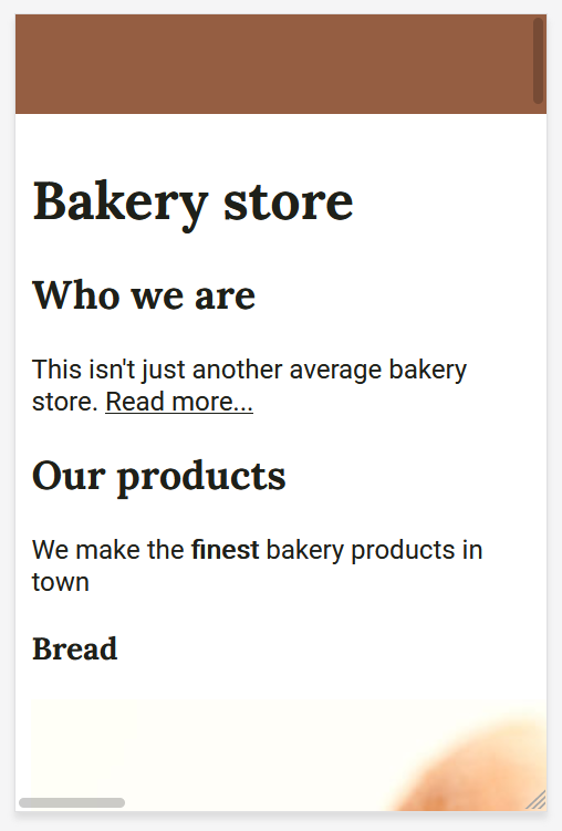
For the course, we are building a pretend bakery website, and so far it is not really that optimized for mobile screens. Particularly, the voices on the top menu always risk overlapping one another on smaller devices.
So, for this media queries assignment, we should use media queries to hide the voices in the top menu (but not the bar) on smaller screens. Obviously, we want to do this following the best practices, so considering the mobile-first approach. The final result (on a mobile device) should look like this:
As always, try do to this exercise on your own. If needed, check the CSS tutorial again before going to the solution. Once you are confident, check the solution below. Be warned, the solution is coming in the very next paragraph!
The Solution
And here’s the solution. To satisfy this requirement, we only need to touch the CSS code – there is no need to modify the HTML code. Particularly, we need the ul element inside the header element to disappear. As we are doing mobile-first, we should start with that element hidden by default. Then, when the screen is large enough, we make it appear.
To do that, we need to use a media query setting a breakpoint at the size of a mobile portrait (according to us, 376px). If the screen is larger than that (min-width), we will apply the rules. This translates into the following CSS code.
header ul {
  list-style: none;
  display: none;
}

@media only screen and (min-width: 376px) {
  header ul {
    display: block;
  }
}
If you are curious to see the entire code for this CSS Tutorial, check it out on GitHub.com. You can find it at alessandromaggio/full-stack-course for the entire course. Instead, if you want to check the code specific of this very tutorial, take a look at this commit.
In Conclusion
In this CSS Tutorial on Media Queries, we saw how to apply different style rules to different devices. Indeed, with media queries, we can target different devices types or different properties.
With this tool, we can create better websites that can truly work in any circumstance, and that are ready for the web of tomorrow.